Augmenta Construction Platform
Turning automation into usability — the redesign behind 42% faster outcomes.
Case study
Context
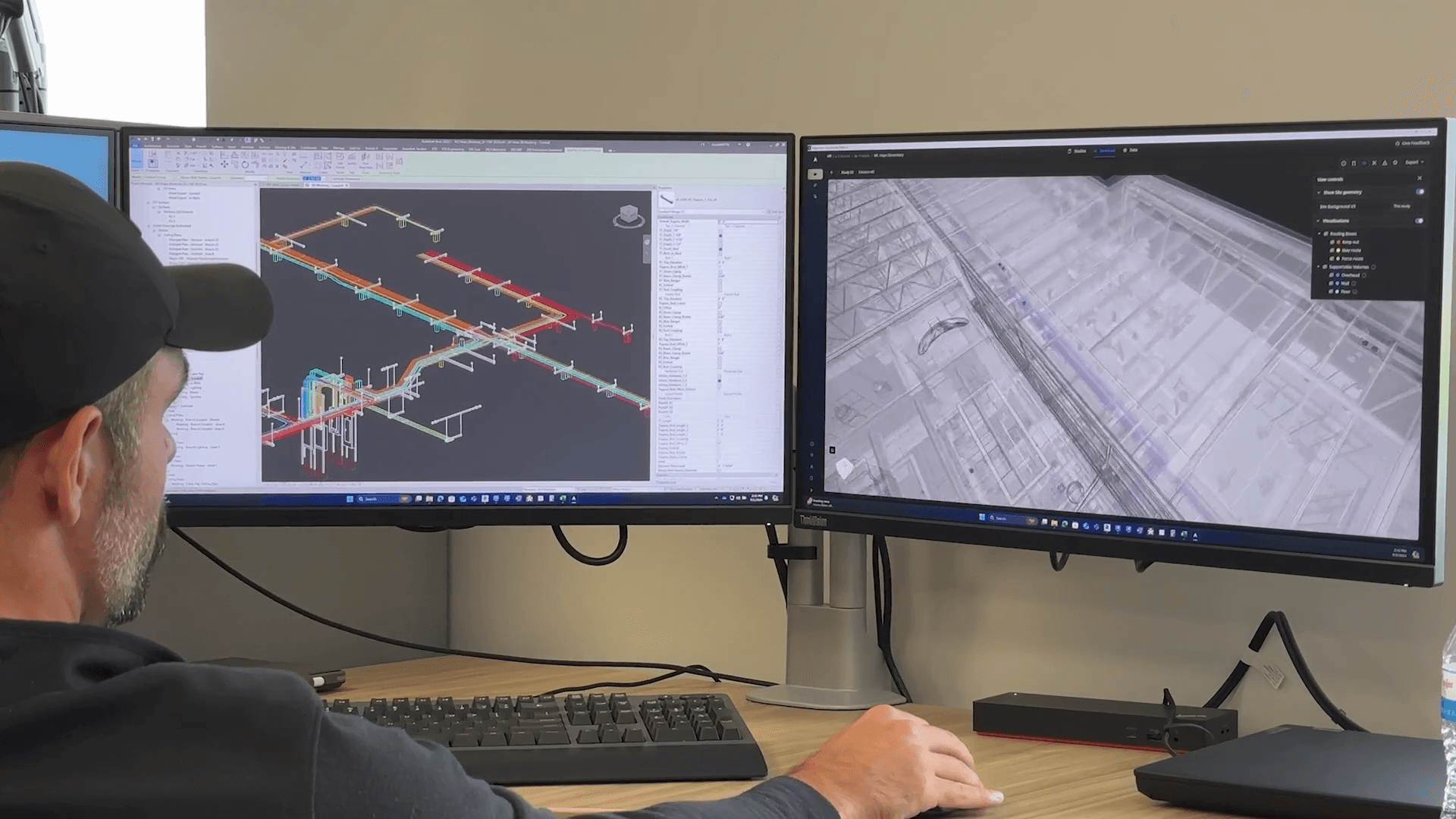
Augmenta generates constructible, code-compliant designs of electrical raceways — the conduit, cable tray, and supports that connect every piece of electrical equipment in a building. Their target user is the Virtual Construction Designer: the engineer inside Autodesk Revit who plans how a project actually gets built. Think Figma, but for the physical world — high-stakes, governed by real-world physics, strict compliance, and precise engineering standards.
When I joined: 1 design partner, 7 pilot firms testing, 20+ on the waitlist, $0 in revenue.
Problem
The product was hard to use. Three symptoms, one root cause:
- Too feature-heavy — trying to serve every persona at once
- Inconsistent, confusing UX — patterns and components drifted across the app
- Slow value delivery — often 2 weeks for a useful output
Implications stretched across the business: customers got unconstructable, slow-to-generate solutions that needed intensive support; the company carried high churn risk and unsustainable compute and support costs; design had to balance complex firm-specific needs against scalability and low-touch usability.
The deeper issue was philosophical. Augmenta's engineering had set high thresholds for correctness and completeness, only surfacing solutions that met strict mathematical standards. Minor input errors — a mislabeled roof material — meant zero solutions, eroding trust and usability.
Approach
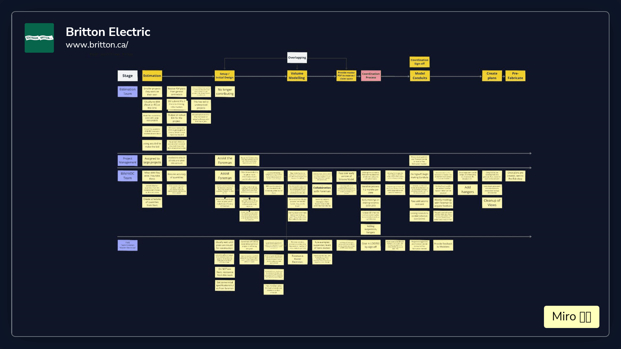
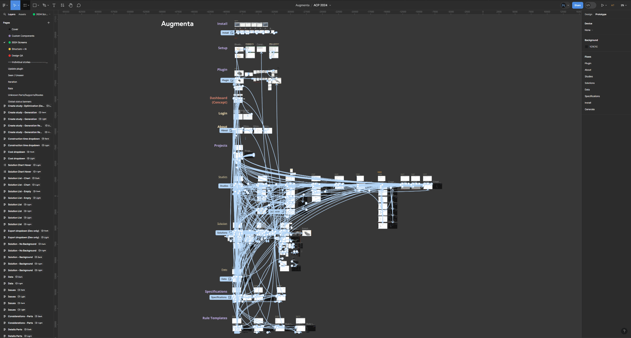
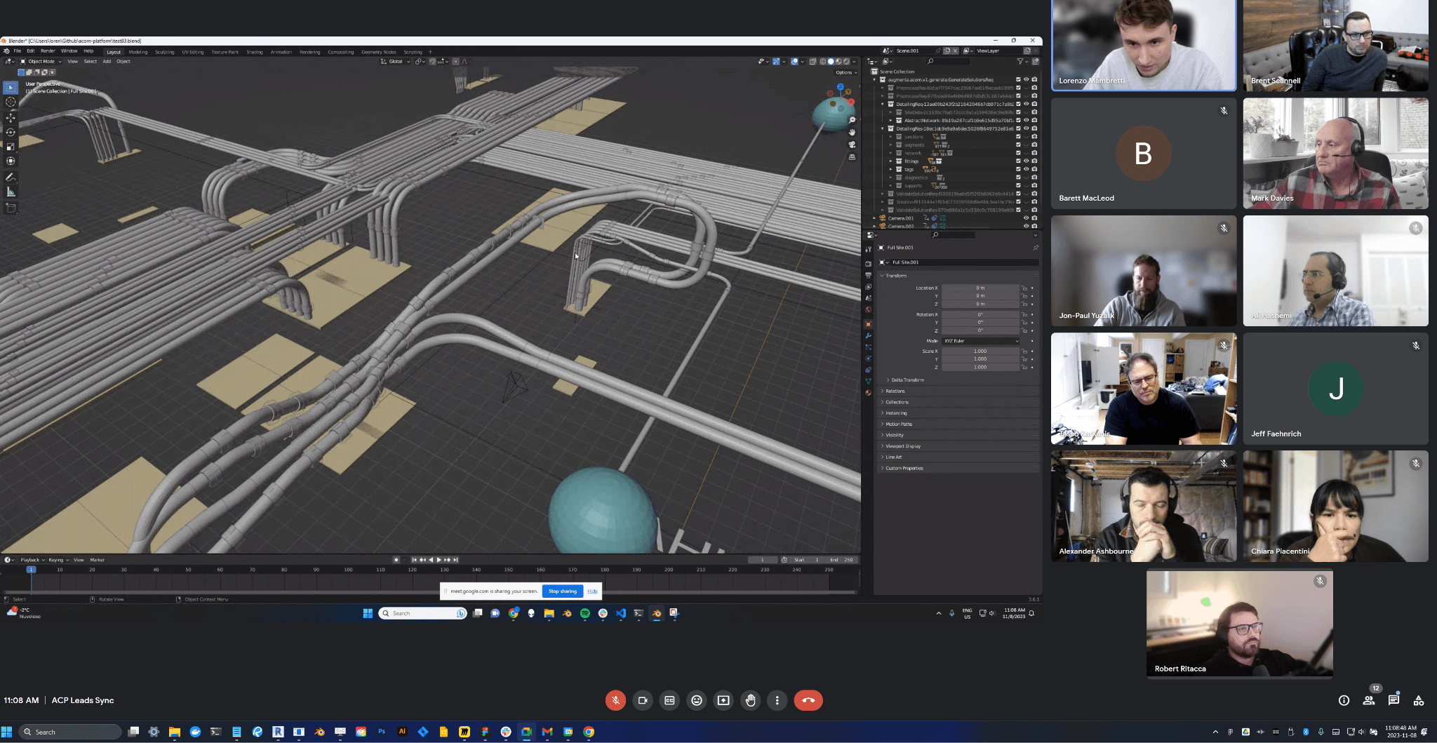
Ran pilot workshops with 7 electrical design firms to map real workflows, test product fit, and prioritize features. We mapped the unified customer journey — Estimation → Planning → Design → Detailing → Pre-Construction → Construction — and decided which stages to prioritize, deprioritize, and deprecate.
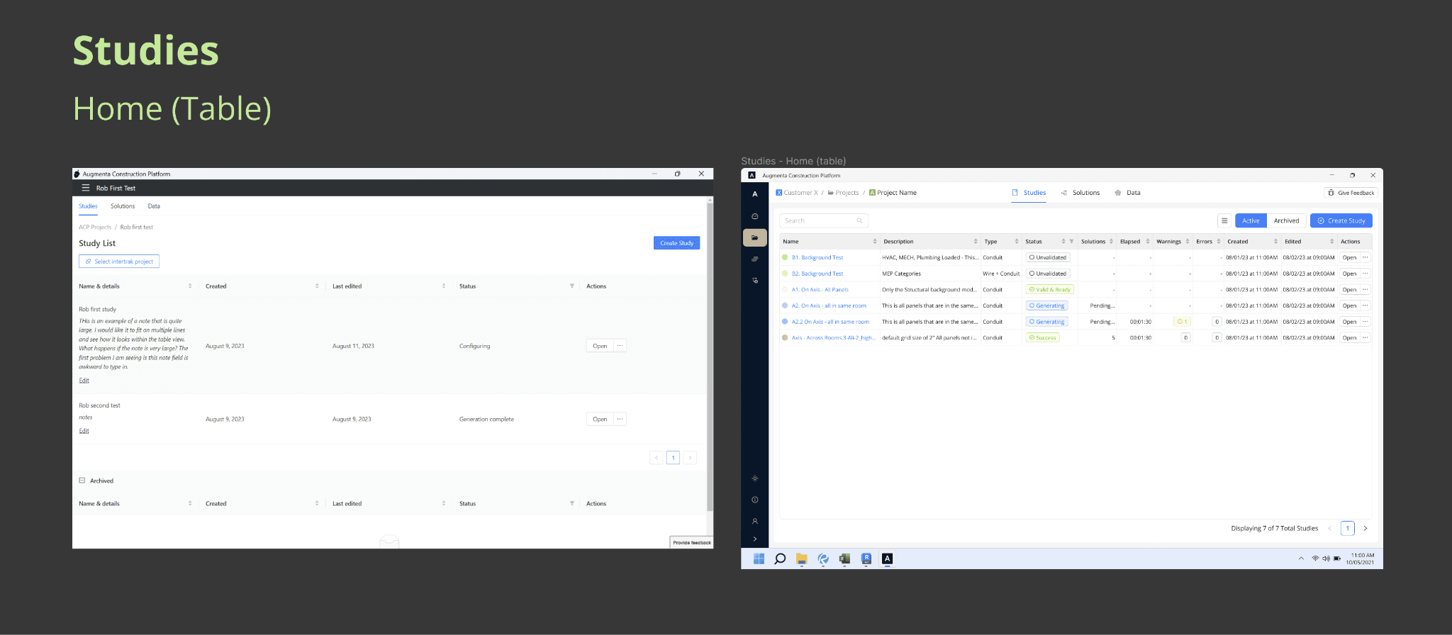
What pilot users actually said they wanted: to get to solutions faster, with less effort. We translated that into simpler data input, an enhanced solution viewer with more data, and a tighter feature set. More signal on output, fewer features to navigate. They explicitly didn't want complex electrical calculations.
Renewed focus: Virtual Construction Design teams, from project kickoff through early phases of coordination. Not earlier (device layout, conduit sizing). Not later (detailing, assembly drawings). One persona, one slice of the workflow, done well.
Solution
Three problems, three answers.
1. Right surface for the right user
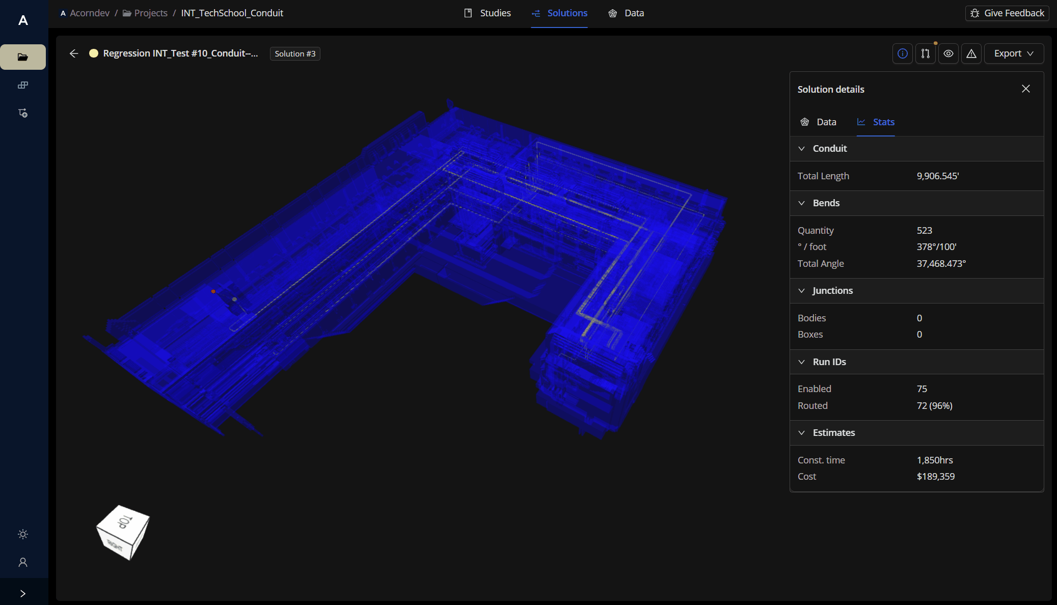
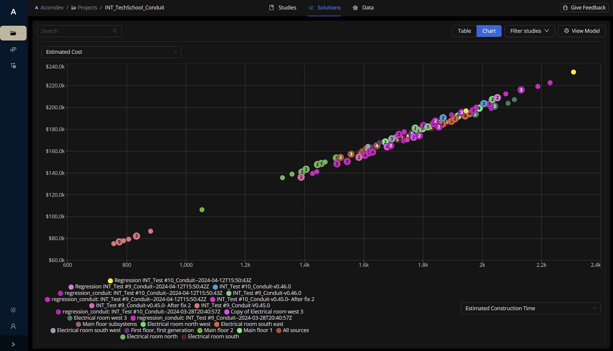
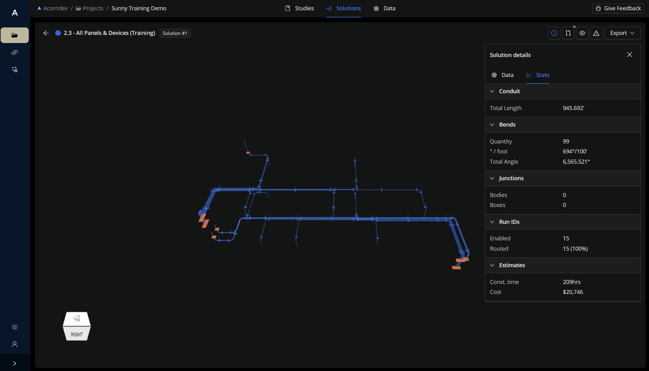
Identified VDCs as the MVP persona. Doubled down on solution data — exposing more signal about completion (routed source/destinations) and correctness (constructability). Deprioritized everything the VDC teams didn't care about.
2. Consistency through a heuristic overhaul
Audited the product against Nielsen heuristics and fixed what the audit surfaced: inconsistent patterns, poor IA, poor use of space, unclear workflows, missing system/status information, incoherent errors. Two emblematic before/after moves:
Screen density — engineers want signal, not whitespace. We rebuilt the canvas to surface more data per pixel without losing clarity.
Framing — language matters. We replaced engineering-speak with intent-aligned language (“Placement considerations” instead of “Unhandled error”), turning error states into actionable guidance.
3. Faster value through better inputs and signal
The bottleneck was generation time — often a full day per iteration. We changed three things:
- Prompt structure — moved from moderately structured, broad input to more structured, granular input so the first pass was usable.
- Signal enhancement — surfaced the previously hidden “unknown” parts of failed runs. Result: successful generations went up 10×, and user analysis of solutions spiked 5×.
- Error handling — moved from unintelligible errors to errors visualized in 3D space, right where the issue was.
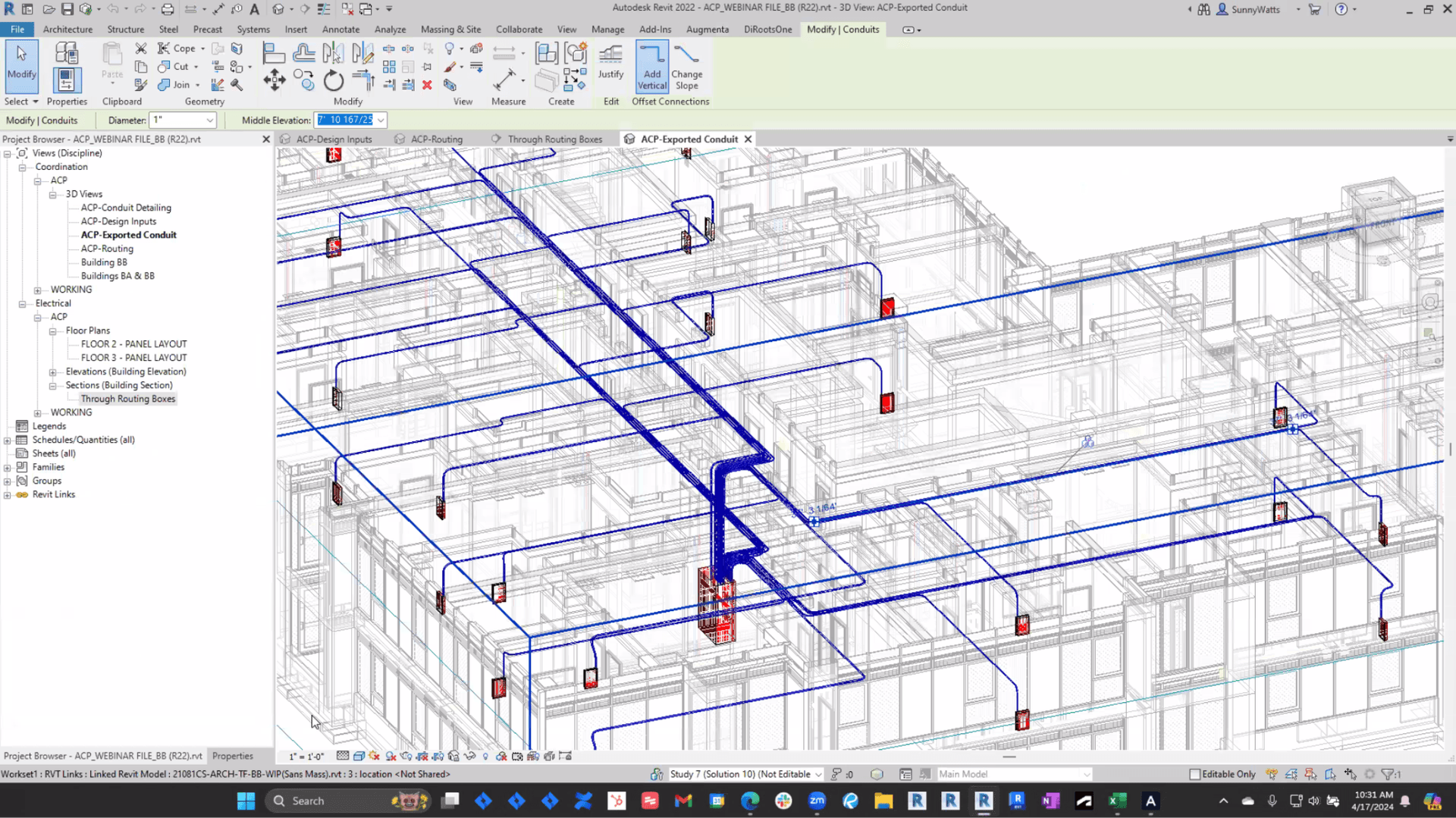
The fully realized workflow ships back into Revit, where the generated designs work seamlessly with existing detailing and spooling pipelines.
Impact (May 2024 vs. August 2023)
| Metric | Aug 2023 | May 2024 | Improvement |
|---|---|---|---|
| Time-to-value (initial prep → final export) | 14 business days | 8.12 business days | 42.3% faster |
| Generation cycles to acceptable result | 12 | 7 | 41.6% fewer |
| Engineering interventions per cycle | 1.08 | 0.7 | 35.5% fewer blockers |
The downstream result: detailed 3D schematics flow into pre-fabrication and field installation in days instead of weeks. Engineering interventions — the single biggest indicator of an unscalable product — dropped by a third.